 Image 1 of


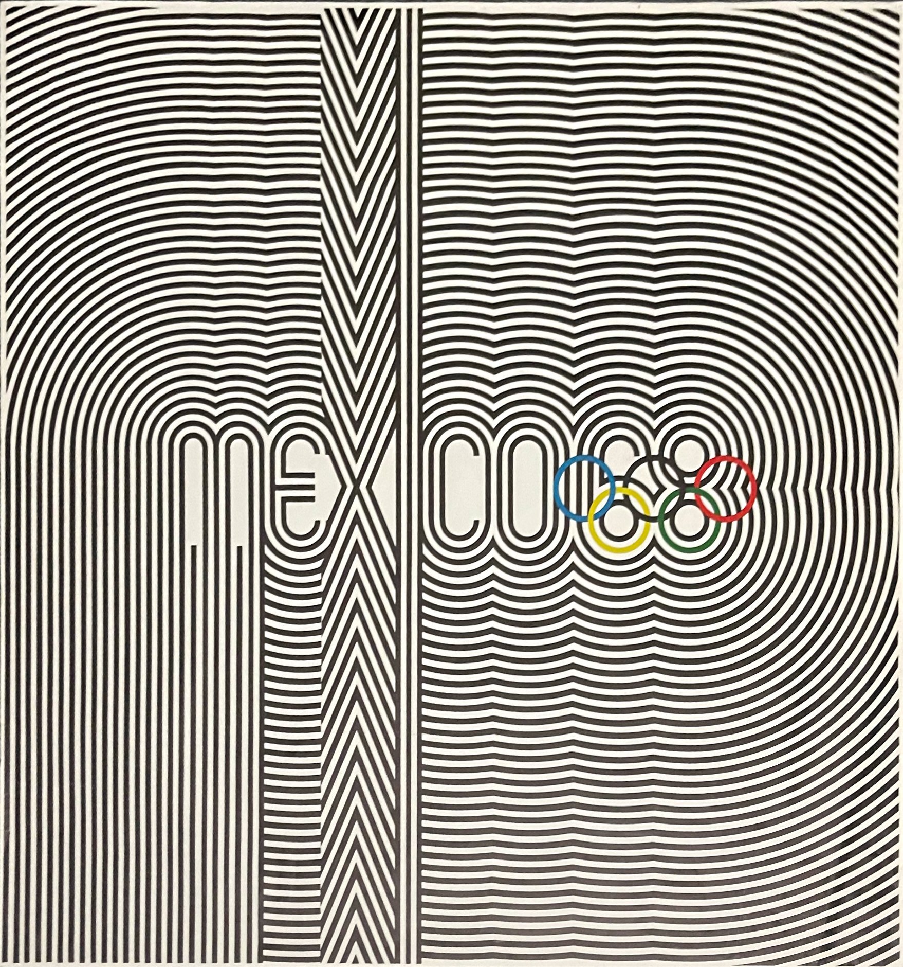
Eduardo Terrazas (1936-) - 1968 Olympic Poster - Black and White OpArt, 1968
$0.00
4 x 34 ″
The poster was influenced heavily by 1960’s Optical art and also aimed to reflect on the pattern-making imagery of pre-hispanic Mexican culture and folk art. The logotype on the poster was designed to mimic the shape of the Olympic rings and create a compelling and geometric design. With a strong use of repetition and parallel lines, this work allows for an integration of typography, color, and the iconic Olympic logo.
The poster was influenced heavily by 1960’s Optical art and also aimed to reflect on the pattern-making imagery of pre-hispanic Mexican culture and folk art. The logotype on the poster was designed to mimic the shape of the Olympic rings and create a compelling and geometric design. With a strong use of repetition and parallel lines, this work allows for an integration of typography, color, and the iconic Olympic logo.
Quantity:
Add To Cart
4 x 34 ″
The poster was influenced heavily by 1960’s Optical art and also aimed to reflect on the pattern-making imagery of pre-hispanic Mexican culture and folk art. The logotype on the poster was designed to mimic the shape of the Olympic rings and create a compelling and geometric design. With a strong use of repetition and parallel lines, this work allows for an integration of typography, color, and the iconic Olympic logo.
The poster was influenced heavily by 1960’s Optical art and also aimed to reflect on the pattern-making imagery of pre-hispanic Mexican culture and folk art. The logotype on the poster was designed to mimic the shape of the Olympic rings and create a compelling and geometric design. With a strong use of repetition and parallel lines, this work allows for an integration of typography, color, and the iconic Olympic logo.


